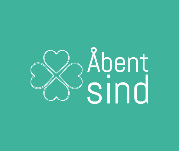
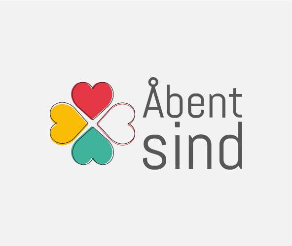
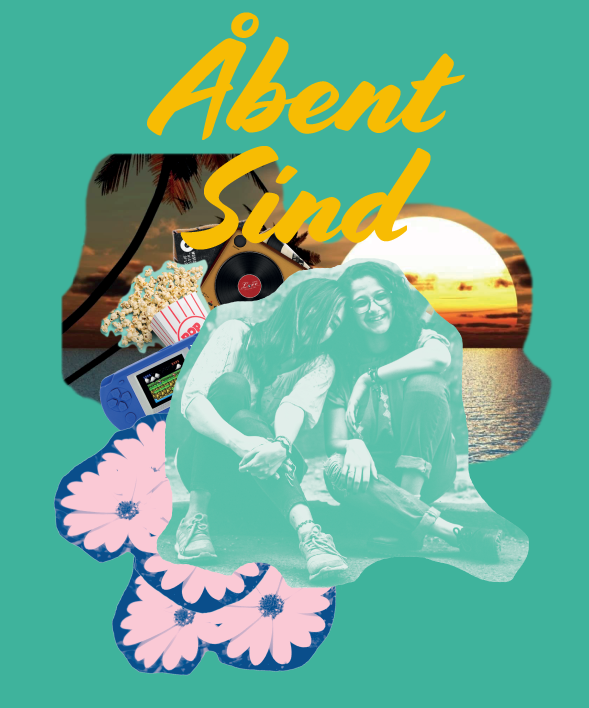
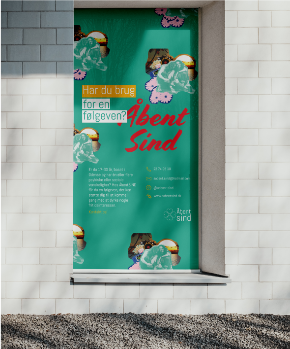
Åbent Sind is a social group that connects young people with social difficulties to build a community with young-to-young relationships in Odense, Denmark, operating under SIND (Landsforeningen for Psykisk Sundhed) umbrella.
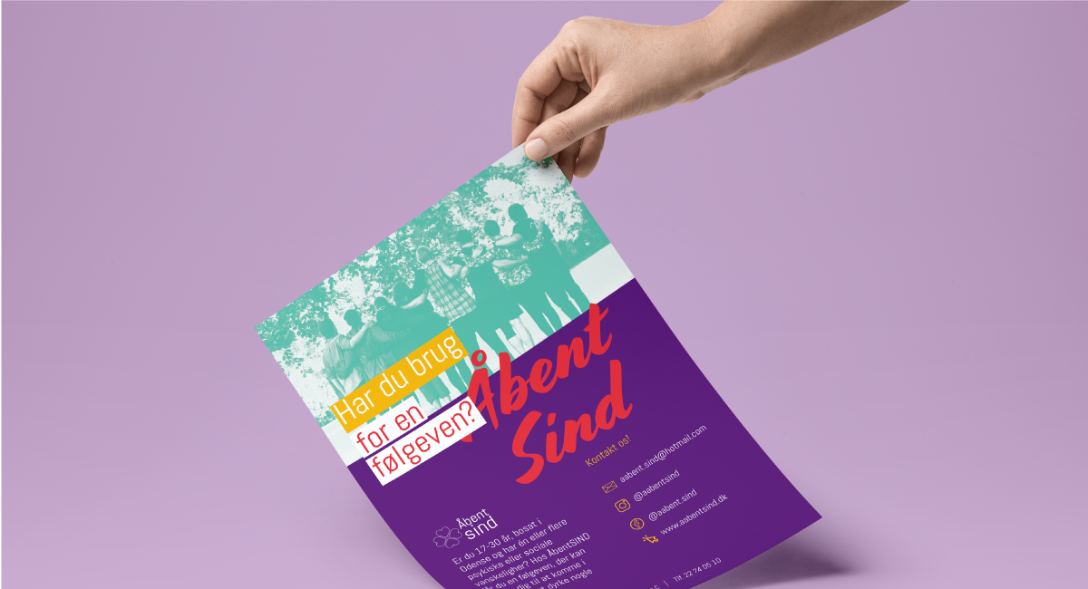
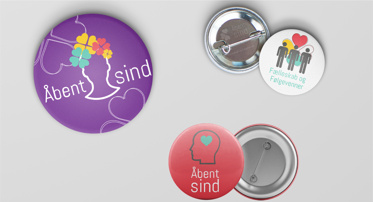
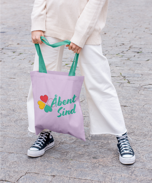
The lack of an identity and attractive visual elements made it hard to develop marketing materials that could stand out and reach the group’s target audience. Our idea was to focus on developing a new branding and visual identity that could capture its vibrant mission.
“Juliana is incredibly easy to work with; she quickly captured the essence of what we needed help with. We are so happy with the connection throughout it. Our logos are timeless and modern, and our flyers have a beautiful design that tells the story we wanted to show”
Camilla Hviid, Frivilligkoordinator
Whether you’re a startup looking to make a mark or an established company seeking to refine your brand’s assets, I’m here to guide you with my expertise and creativity
Tell me about your project, so I can craft the perfect plan to bring your brand’s vision to life. Let’s connect today!